
So I hope research would look for something like this:
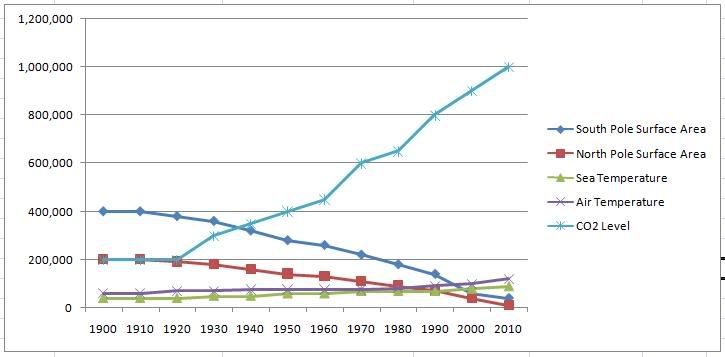
To add to this graph, mean temperatures of the Sea, as well as air in the area would be added to the graph. You would also add into CO2 emmisionography. (that would look like this:)
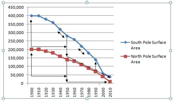
The point I was trying to make, is that between the first 50 years and second 50 years, is the difference the same (what you would expect if climate change was natural) or if the hypothesis that climate change is natural but exacerbated by CO2 emmisions then you would see a significant difference between the two quasi-experimental conditions. With a cross section as above, you can look at the differences internally between each polar region, as well as compare the differences between the two...is one's increase bigger than the other? for example, or are the differences in proportion? Does the CO2 really relate to climate change? Did it cause it or effect it?
I love stats and graphs! :D